

Games’ graphics manual
Tomi Grgicevic © McCord Stewart Museum, 2025
Interview conducted on December 8, 2025.
[Graphic designer Raymond Bellemare is seated near some shelves in a light-filled archives centre. To his left appears the front cover of a publication. Across the top is written, “Games of the XXI Olympiad. Montréal 1976. Graphics Manual.” Filling the centre is the large red emblem of the Montreal Olympic Games, composed of five interlaced rings, topped by three curves resembling a podium.]
Raymond Bellemare : A guide was needed for efficiency. Without one, you would have to question the look of each individual project.
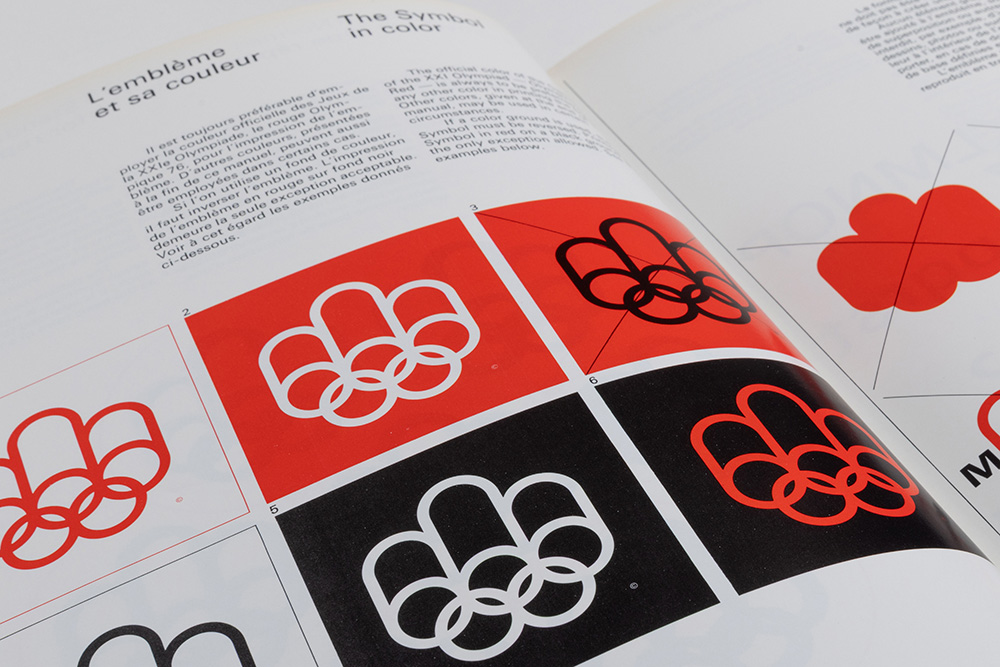
[Pages 14 and 15 of the bilingual manual feature a text entitled The Symbol in color. Underneath are 12 examples of the logo, most of them in red, but some in black or white as well. Other pages in the manual provide details on how to construct the curves and lines of the symbol, as well as the standards for reproducing the logotype.]
Standards aren’t actually constraining. On the contrary, they simplify things. Because you know in advance that you don't have to find another style. It's already established, it's been discussed, and you know what to do.
[The McCord Stewart Museum logo appears in white on a black background. Copyright: McCord Stewart Museum, 2026, appears in the lower right corner of the screen.]